This time I'll be discussing the influence of celebrities on the media. We all know that some celebrities have become something of a brand name in some cases. Often simply putting their name in front of something is enough to sell an otherwise ordinary product. Celebrity endorsement campaigns are also similar to this just that here its a simple matter of them saying, "I like it and therefore so should you." Lastly there's the approach where by a celebrity will simply make an appearance on the advertisement of the product.
Celebrities undoubtedly have a great amount of power when it comes to western culture, this is something that the media is very aware of. Perhaps its their lavish lifestyles, sometimes eccentric behavior or just the fact that they have so much influence that gives them influence (if that makes sense). There's a blog I was reading (http://celebritycultureandtheamericandream.wordpress.com/page/2/) which goes more in depth with this but if I have to sum it up myself I'd say that I think people are mainly interested because we like to see how the other half lives. We cling onto what they do and say because it holds influence and while it may not always directly effect our lifestyle (unless your a fan boy/girl with an unhealthy obsession) its nice to be able to sit back and see what effects those who hold influence and power. I think its also the fact that part of us wants to be them and be in the situations they are in. Being able to say something small and have it listened to by millions is has a certain appeal. It is odd to think that part of the reason they influence people is because they have influence but in a sense that seems to be how people work. We want a figure to aspire to and want a figure to lead us on a path that could bring us as much success as said figure. Lastly here are some two books I found that goes into depth with the topic of celebrity influence if you're interested:
Celebrity and Power by P.David Marshall: http://books.google.co.za/books?id=OMzCDi292OwC&printsec=frontcover&source=gbs_ge_summary_r&cad=0#v=onepage&q&f=false
Hedgehog Review: http://www.virginia.edu/sociology/publications/milner%20articles%20for%20web/celebritycultureasastatussystem.pdf
Starting with Conde Nast I'm going to trace the history of celebrity endorsement until present day through ten examples (most of these can be found here: http://www.condenast.com/):
1. For those who don't know, Conde Nast publishes the well known and still going magazines known as Vogue and Glamour. The name says it all, so here are just some examples. The cover of this 1939 October issue owes its cover picture to the well known Vivien Leigh.

2. Another example of glamour, the October 1968 issue

3. Vogue has always included articles on fashion and celebrities of the time. Here is one example of just that. Its the cover of the 1971 November issue of Vogue and as seen already entails some celebrity gossip as one of the headlines.

4. As seen with GQ magazines began to cater for a male audience in this December 1983 issue. The magazine also had earlier releases however it was only aquired by Conde Nast in 1979.

5. Vanity Fair is another notable magazine that focused on the celebrities of the time. Here is a July 1984 cover of the popular magazine.

6. Here is another issue of Vanity Fair, the October 1992 issue. It features the well known pop Madonna wearing pigtails (and not much else) on the cover. Madonna was both a sex symbol and a pop icon so its not hard to see why they selected her for the cover shoot and article.

7. Here's another more recent issue of GQ featuring Brad Pitt on a June 2005 issue of the popular men's magazine. Brad being a man I imagine a lot of men aspire to.

8. A September 2006 issue of Vogue featuring Kirsten Dunst in her role as Marie Antoinete.

9. GQ going for sex appeal in this October 2008 issue featuring the sought after Megan Fox. Being a men's magazine I imagine the sex sells idea worked well here.

10. Lastly there's the September 2010 issue of Vanity Fair featuring the then very popular Lady Gaga. Here its not hard to see the main subject of the issue.

As a graphic designer myself I do consider magazines to have contributed to design as a whole a great deal. As the years went by typography and well shot photography was used in unison to create some of the most brilliant designs there is. I personally do not read magazines but always catch myself glancing at the interesting designs used on much of their cover pages. To me all the elements of design coming together so well is an artwork in itself.
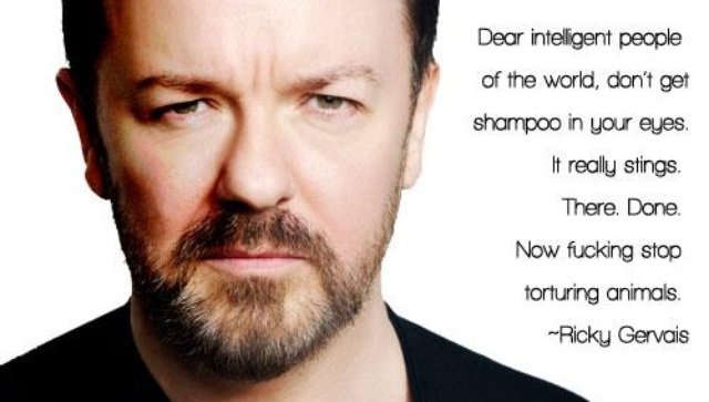
Finally if I had to choose a celebrity image or brand that interests me most I'd have to say the British comedian and actor Ricky Gervais. I suppose it's mainly because I respect him as a person because he seems to embody a lot of traits I value. His an intelligent man that doesn't take the world too seriously but still stays true to his beliefs. I can't say that his sense of style or taste in things such as food or music influences me however if ever I walk happen upon something such as a documentary (idiot abroad which was amazing) or film that he has anything to do with it often interests me not only because I find his comedy funny but because from what I've seen he is generally an interesting admirable person.


