Hi all
This time I'll be discussing three brands that I admire and desire as a designer. Being a graphic designer there is no easy answer in this but if I really have to choose then it would likely be these three for the moment:
In third place we have:
Microsoft Windows:
Windows is a brand that's been around since I was a child. It's been synonymous with a an introduction to a multinational tool and a dynamic new way of doing things. I remember first using a PC back when they were not as common as they are now and playing some simple 2D games and watching a screen saver of a creepy house just to hear the sound of a grandfather clock once the moon reached the end. So really this is a brand I've grown up with and because of that it has an almost sentimental part in my life. I've seen their logo change with almost every new windows release and from what I can remember the brands logo seemed to keep up with the times. For instance the one above which was seen in the windows 7 package was very bright and it glowed with silhouettes of different sights where as the Windows 8 logo is very flat with a single flat colour all round. Both work for designs of the time there's no arguing that but if I must be honest the four colored window is such a classic logo and I don't think that should have changed with the arrival of Windows 8. Flat color if perfect for the time (as can be seen by many current website designs) but in my opinion don't fix what isn't broken, the four color logo was a classic aspect of the brand that should not have been changed.
In second place we have:
Alienware:
To be honest I don't own a lot of Alienware products but as a brand I've always liked their style which is that their hardware/PCs etc. has always not only looked good but seemed to be worth the high prices. Products they offer always have a type of razor sharp, dark and futuristic feel to them which is a great change to the overly simplified clean cut feel most brands are going for these days (Apple). I think their logo works well as their target market is PC gamers such as myself who find a PC with all the latest hardware all put together with a nice look and feel appealing. They may not be as important as windows but as a gamer I love both their logo and brand. As to what I'd change I cant say much other than that old school looking gradient they've got going on their typography of their logo. I would go for 3D animation to give their logo a more futuristic feel since I doubt they're going for an old school feel.
And finally in first place we have:
Google

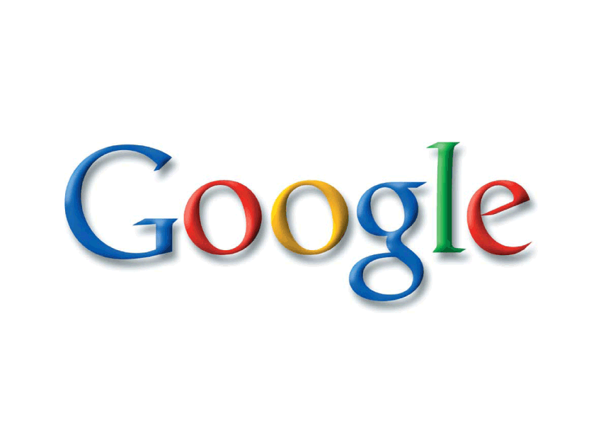
Perhaps its a cliche but I love the look, feel, style and everything else that goes with this brand. Googles all for creativity which I love. I think their colorful yet simple logo works brilliantly. Even the word google which if you aren't aware is a word for an immense number (which I will not go into right now). The word works because as we all now simply putting in a single word in the search engine gives the user a huge number of results in seconds. Its playful, creative in a way that can still be taken seriously. The colors and font choice are evident of this. I'd like to say that there's something that needs changing but I honestly can't. That's not to say that its perfect (nothing is) but it comes down to the fact that it's just a nice brand with nice ideas and I simply can't think of any better solution than they have already. It just works, what more can be said?


No comments:
Post a Comment